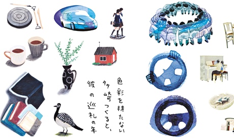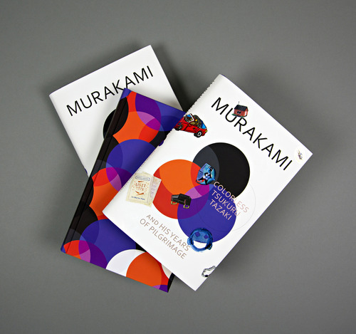
Not a Wind-Up … some of the stickers being given away with the new Haruki Murakami
Here is a fragment of the post:
A press release informs us that Tsukuru means "to make" or "to build" in Japanese. Hence – obviously – the stickers, which will "encourage the reader to decorate the novel themselves".
Publisher Harvill Secker's creative director Suzanne Dean said: "My young son's delight in using stickers everywhere started me thinking about this. I had seen stickers used on Royal Mail stamps, on CDs and, of course, in children's books, but I didn't think they had been incorporated into adult fiction." What an oversight. I'm sure a fair number of readers' young children, anyway, will appreciate the idea. And eBay's appetite for ephemera that has been kept away from grubby-pawed infants is, of course, boundless.
To read the whole thing go to:http://www.theguardian.com/books/2014/jun/19/haruki-murakami-marketing-publishers-stickers
The names of the designers are: Mio Matsumoto, Shinko Okuhara, Fumio Obata, Ryu Itadani and Natsuko Seki. Each was them was given a character and a color to work with. Each was given a character, and therefore a colour. Here is the link to the original story on the vintagebookdesign page which explains more about the idea, the process and the five designers. http://vintagebooksdesign.tumblr.com/post/89255962911/haruki-murakami-colorless-tsukuru-tazaki-stickers

Here is a fragment about Fumio Obata:
" He was born in Tokyo and came to Britain in 1991. He studied at the Glasgow School of Art and the Royal College of Art in London. He worked in animation for some years before deciding to concentrate on comic books and illustration. His Just So Happens (2014) had recently been published by Jonathan Cape. He feels lucky that he got the colour, Blue, that he wanted. Did designing a sticker change the way he worked? ‘It was more of the subject matter that forced me to change my style rather than the form of outcome. I chose certain objects to illustrate from the text because of their noise, for instance Elvis Presley’s “Viva Las Vegas” was an inspiration for the first image I did. The tune was used as a background noise for a cellphone call in the story. It made my work easier for the rest of the images as I started using my watercolour washes imagining the sound surrounding the characters.’"
http://www.mtv.com/news/1850682/haruki-murakami-stickers/